This article was last updated on April 16, 2022
Canada: ![]() Oye! Times readers Get FREE $30 to spend on Amazon, Walmart…
Oye! Times readers Get FREE $30 to spend on Amazon, Walmart…
USA: ![]() Oye! Times readers Get FREE $30 to spend on Amazon, Walmart…In light of the MtGox exchange debacle, the price pattern of Bitcoin got me thinking. I recall having an analyst explain the concept of a "head and shoulders" stock chart pattern for me on a stock that I held that explained why the stock price was unlikely to rise to its previous high.
Oye! Times readers Get FREE $30 to spend on Amazon, Walmart…In light of the MtGox exchange debacle, the price pattern of Bitcoin got me thinking. I recall having an analyst explain the concept of a "head and shoulders" stock chart pattern for me on a stock that I held that explained why the stock price was unlikely to rise to its previous high.
For those of you that aren't familiar with the concept, here is a very basic explanation from Investopedia:
A head a shoulders pattern is one where the price of a share:
"1. Rises to a peak and subsequently declines.
2. Then, the price rises above the former peak and again declines.
3. And finally, rises again, but not to the second peak, and declines once more.
The first and third peaks are shoulders, and the second peak forms the head."
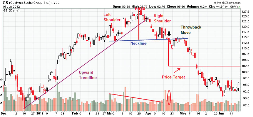
This is what a head and shoulders pattern looks like:
This pattern is considered to be one of the most reliable trend-reversal indicators. The downward pattern is made up of a period of falling peaks and troughs, indicating a weakening price trend when compared to the head. Price is most likely to continue to decline once the price breaks below the neckline of the pattern.
Now, here is a chart showing the trading price of a Bitcoin in U.S. dollars between November 1, 2013 and January 1, 2014 from Bitstamp, one of the world's largest Bitcoin exchanges based in Slovenia:
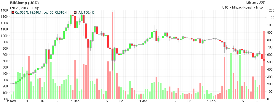
While the shoulder on the rising portion of the chart (the left shoulder) is rather narrow and not as pronounced as in the example given above, the presence of a prior uptrend is one of the key parts of a head and shoulders pattern. As well, the volume on the left shoulder is generally higher than the volume when the head is formed, another signal. Trading volume then increases during the price decline with several days of very high volume in early- and mid-December 2013. The right shoulder forms between December 7th and 17th. It is rather difficult to draw a line that forms the neck, however, it is somewhere between $700 and $800.
Here is a graph showing the trading price of a Bitcoin from November 1 to the present:
This last Bitcoin chart looks very similar to this chart showing the price of Goldman Sachs during 2011, with the exception being Bitcoin's narrow left shoulder:
Using a head and shoulders pattern, one can predict the price decline by measuring the distance between the neck and the top of the head. This distance is then subtracted from the neckline to give us the target price. If the head measures at $1140 and the neck measures at $750, the distance is $390. If this is subtracted from the neck at $750, the target price is then $360, about $160 lower than its current level. As you may have noticed on the chart for Goldman Sachs, the price dropped substantially lower than the target.
The head and shoulders reversal pattern can take many months to complete. When a stock breaks below the neckline, there is no longer any support and very rapid price declines can occur, often with an increase in volume as we are currently seeing for Bitcoin.
Only time will tell us whether Bitcoin is following a typical head and shoulders pattern or whether the recent price decline will reverse itself.
Click HERE to read more of Glen Asher's columns
You can publish this article on your website as long as you provide a link back to this page.


Be the first to comment