
 The Government Accountability Office (GAO) recently released its 2011 Financial Report of the United States Government. I actually like this report; since I have a business background, I find that it reads more like a corporate annual report. In this case, the Financial Report provides the President, Congress and Main Street America with a comprehensive look at how the Federal Government is (mis)managing taxpayer dollars by outlining the Government’s financial position, its revenues, costs, assets and future liabilities.
 Let’s open with Timothy Geitner’s introduction to the report:
"This report provides another sobering picture of our long-term fiscal challenges.".
That sounds, well, rather sobering, doesn’t it, especially since it’s coming from a former Fed President?
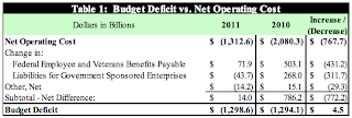
Here’s a snapshot of the condition of America’s finances at the end of fiscal 2011 compared to:
If you think of this as a report card for both the Presidency and Congress, one would have to think that any teacher would assign a letter grade of "F". Now, let’s break down the data a bit further.
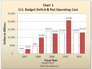
Here is a graph showing the United States’ budget deficits and net operating costs for the past five years:
The budget deficits of fiscal 2010 and fiscal 2011 were nearly identical at $1.294 trillion and $1.299 trillion respectively; a slight increase in revenue for 2011 and a decreased net cost (due to a drop in costs for federal employee and veteran’s benefits and a decline in the cost of economic recovery programs) led to a drop in 2011 net operating cost to $1.313 trillion, down from $2.080 trillion in fiscal 2010. Basically, it was the so-called "economic recovery" that reduced overall net operating costs; when the economy heads south again (as it surely will), net operating costs will rise as they did between 2007 and 2010 as government tosses more stimulus dollars into the pot.
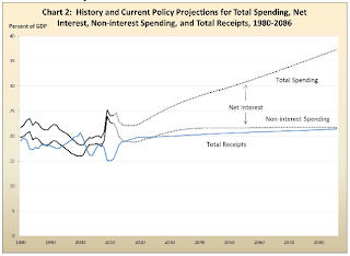
The GAO is quite concerned about the long-term fiscal challenges facing the United States. Here is a graph showing the GAO’s frightening fiscal projections for overall spending both including and excluding interest on the debt and revenue to 2086 as a percentage of GDP:
You will note the massive increase in net interest spending as time passes. The cost of the debt is expected to rise as a percentage of GDP even if both federal government spending and receipts remain at a relatively stable 20 percent of GDP. Net interest costs alone will ultimately reach over 15 percent of GDP due to increased debt levels, a scenario that is most likely unsustainable.
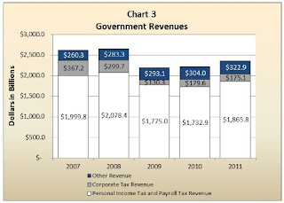
Now, let’s look at government revenues for 2011. First, the level of corporate profits rose in fiscal 2011 but at a slower rate than in fiscal 2010. Despite the rise in corporate profits, corporate tax revenue dropped by $4.5 billion (or 2.5 percent) on a year-over-year basis as shown on this graph:
As I’ve posted previously, you will notice how corporate tax receipts declined in 2011 despite the fact that the economy was improving. As well, corporate tax receipts are less than half of their level in 2007, prior to the beginning of the Great Recession.
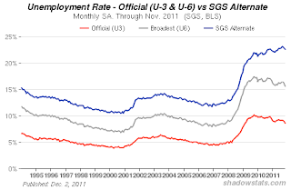
The level of personal income tax revenue rose by nearly $133 billion from fiscal 2010 to fiscal 2011, an increase of 7.7 percent. Personal tax revenue is now at 90 percent of its pre-Great Recession peak in 2008 compared to corporate tax revenue which is at only 48 percent of its pre-Great Recession peak in 2007. Perhaps corporations really do need a cut in the 35 percent levy! What I find interesting is the 7.7 percent year-over-year rise in personal tax revenue when one considers that the job market is hardly what could be termed as robust; U3 unemployment was stubbornly stuck in the 9 percent plus range all year and more comprehensive unemployment statistics showed unemployment levels well in excess of 15 percent as the Shadow Government Statistics website shows here:
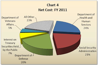
Now, let’s take a quick look at where Washington spent its windfall. Here is a pie chart that breaks down where government allocates your tax dollars:
The bulk of spending is in three areas, Department of Health and Social Services, Social Security Administration and the Department of Defense. Each of these consumes between 20 and 24 percent of Washington’s revenue.
Here is a graph showing Washington’s assets and liabilities:
Washington (or rather, taxpayers) owns about $2.707 trillion in assets comprised mainly of property, plants and equipment ($852.8 billion) with the remainder in paper including net loans receivable, those lovely mortgage-backed securities and other investments ($985.2 billion). The problem with government assets like property and equipment is that their value is often difficult to accurately assess; for instance, what is the value of a National Park and is there a even a market for such a property? On the liability side of the ledger, Washington has $10.174 trillion worth of debt securities outstanding (Treasuries plus accrued interest), Federal government employee post-employment benefits and veteran’s benefits totaling $5.792 trillion and other liabilities of $1.526 trillion for total liabilities of $17.493 trillion. Doing the arithmetic results in net liabilities of $14.785 trillion. On top of this debt, there is intragovernmental debt which occurs when one part of the Federal government "borrows" from another; this debt totals $4.7 trillion. This represents government debt held by government trust funds including the Social Security and Medicare Trust Funds which are required to invest excess annual receipts in Federal government debt securities. Because these are liabilities of the Treasury and assets of the Trusts, they cancel each other out.
From the report, here is a graph showing the projected non-interest spending by the government for the next few decades:
The difference between non-interest spending and what the government takes in is termed the primary deficit or primary surplus. You will notice the black line showing Washington’s total revenue as a percentage of GDP; where the coloured portion of the graph rises above the black line, there is a primary deficit (remembering that the primary deficit excludes interest owing on the debt). The primary deficit soared in 2009, 2010 and 2011 as the government bailed out the economy (i.e. TARP et al). During those 3 years, the primary deficit reached nearly 10 percent of GDP both because of increased spending and decreased tax revenues. That is expected to drop to the point where there is a small primary surplus between 2015 and 2019 as the spending reductions in the Budget Control Act kick in. The primary surplus ends in 2020 as spending on Social Security, Medicare and Medicaid rise; the primary deficit is expected to peak at 1.3 percent of GDP in 2035. You will notice that this projection does not include the possibility of another Great Recession that would require a massive federal government bailout as was the case in 2009 – 2011. That is why the black line and the coloured areas are so smooth as we move into the future. Looking back, one can see that the recessions of the early 1980s, 1990s and 2000s resulted in far higher primary deficits than would have been projected prior to their arrival. The same holds for the future with one difference; the increased spending on entitlements will mean that the Federal government is starting from a primary deficit rather than a primary surplus, making the fiscal situation even more difficult to control.
As I mentioned earlier, the GAO is concerned about the changing demographic that will impact the fiscal picture in the future; America’s aging population will result in persistent growth in Medicare, Medicaid and Social Security costs. Here’s a quote from the report:
"Largely as a result of the provisions in the Budget Control Act of 2011,4 the fiscal outlook has improved. However, rising health care costs and the aging of the U.S. population continue to create budgetary pressure. The oldest members of the baby boom generation are now eligible for early Social Security retirement benefits and for Medicare benefits. In addition, debt held by the public continues to grow as a share of the economy;this means the current structure of the federal budget is unsustainable over the longer term." (my bold)
According to the Medicare Trustees’ Report, spending on Medicare alone is expected to rise from 3.7 percent of GDP in 2011 to 5.6 percent in 2035 and 6.2 percent in 2085. The Hospital Insurance Trust Fund is expected to remain solvent until only 2024 after which time, tax income will only cover 90 percent of benefits, declining to 76 percent in 2050. Social Security costs are expected to rise from 4.8 percent of GDP in 2011 to 6.2 percent in 2035 and declining to about 6.0 percent by 2050. The Social Security Trustees’ Report notes that the annual Old-Age, Survivors and Disability Insurance Trust Funds (OASDI) income will exceed annual costs until 2023 at which point it will be necessary to begin drawing down the trust fund assets until assets are exhausted in 2036. After funds are exhausted, tax income will cover only 77 percent of benefits in 2036 and 74 percent in 2085.
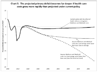
Let’s look at what happens to growth in the primary deficit as a percentage of GDP if health care cost growth is more rapid than projected:
If Medicare and Medicaid expenses grow just 2 percentage points faster than the GAO projects, the primary deficit (excluding interest on the debt) reaches 20 percent of GDP by 2085. This doesn’t sound like much until you put the number into perspective. Right now, the entirety of Federal government spending as a share of GDP, once again excluding interest on the debt, is 22.6 percent. To put the deficit into dollar terms, the 75 year present value fiscal imbalance of this 2 percentage point increase in Medicare and Medicaid spending is a rather scary $66.5 trillion or just over 4 times the current level of the entire federal debt.
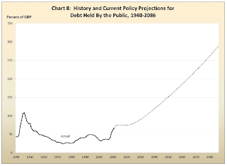
When we take all of this data into consideration along with projections for interest rates and GDP, here is what we end up with:
Over the next 75 years, the debt-to-GDP ratio is projected to rise to 283 percent, down markedly from the projections of 352 percent in last year’s Financial Report, largely because of spending reductions called for in the Budget Control Act of 2011. While this may appear to be a meaningful improvement, a projection is just that, a projection. From the graph showing what happens when spending on Medicare and Medicaid increase by just 2 percentage points, you can see how sensitive the projections are to small increases in spending or declines in revenue.
The sooner Congress makes meaningful progress towards fiscal consolidation, the less painful it will be for America. If reform begins in 2022 rather than immediately (assuming an immediate reform of 1.8 percent of GDP), the primary surplus must be raised by 2.2 percent of GDP, by 2032, the primary surplus must be raised by 2.8 percent of GDP just to keep the debt-to-GDP level in 2086 equivalent to the level in 2011. The increased cost incurred by delaying is a result of rising interest on the rising debt level.
Let’s close this rather lengthy posting with one last quote from the report:
"If a higher debt-to-GDP ratio increases the interest rate, making it more costly for the government to service its debt and simultaneously slowing private investment, the primary surplus required to return the debt-to- GDP ratio to its 2011 level will also increase. This dynamic may accelerate with higher ratios of debt to GDP, potentially leading to the point where there may be no feasible level of taxes and spending that would reduce the debt-to-GDP ratio to its 2011 level." (my bold)
Click HERE to read more of Glen Asher’s columns.
Article viewed on Oye! Times at www.oyetimes.com
You can publish this article on your website as long as you provide a link back to this page.



Be the first to comment