There is an economic measure that is rarely mentioned in the mainstream media that may help us to better understand the relatively modest performance of the economy since the end of the Great Recession.
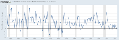
Here is a graph from FRED showing the real (i.e. after correcting for inflation) output per hour of all non-farm workers from 1947 to the present:
Here is the same data showing the year-over-year change in the real output per hour:
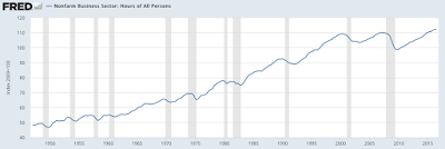
While I realize that there is a lot of “noise” on the graph, if you look carefully, you will notice that after every recession (shaded grey) there is a burst of real growth in hourly output that, in many cases, tapers off after the economic expansion is firmly in place. This is particularly the case after the 1974 – 1975 recession and the 1981 – 1982 recession. As you can see on this graphic, part of the reason for the sharp rise after the end of a recession is the lag in the number of hours worked by the workforce as a whole after the economy begins to expand:
A drop in the number of hours worked and an increase in output that accompanies the end of a recession obviously puts upward pressure on the real output per hour.
Going back to the growth rate of real output per hour, let’s focus on the period since the beginning of the 1970 recession:
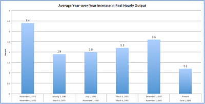
It is quite apparent that the current period of economic expansion has experienced a far different degree of real growth in hourly output than its predecessors. Here is a table showing how the year-over-year increase in real hourly output has varied over the past six major economic expansions since 1970:
For those of you who, like me, prefer a graphical representation, here is the same data in bar graph form:
As you can see, the average year-over-year increase in real hourly output since the Great Recession is, by a wide margin, the lowest in the last six economic expansions. In fact, it is the lowest average going all the way back to 1947; by way of comparison, the average year-over-year increase in real hourly output during the expansion of the 1960s was 3.1 percent, hitting a peak of 7. percent in the first quarter of 1962. That certainly makes the most recent recovery look pretty mediocre, doesn’t it?
As we’ve seen, the post-Great Recession recovery has been spotty at best with the drop in the growth levels of real output clearly exhibiting one of the economic headwinds that have kept economic growth rates relatively low. With productivity growth declining, we should be keeping watch for both dropping growth in wages and profits in the future since both are closely related to increasing productivity.
Click HERE to read more.
You can publish this article on your website as long as you provide a link back to this page.


Be the first to comment