Just about everyone has heard of the Case-Shiller Home Price Indices, a leading series of monthly calculations of the changes in the value of homes in the United States. This key index was created by Robert Shiller, an economist at Yale and Karl Case an economist at Wellesley College.
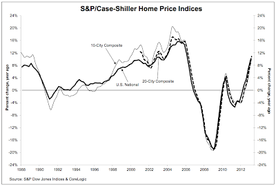
Recently, the Case Shiller index has shown that house prices in both the 10- city and the 20-city composite indices have just seen their biggest annual increase since the housing market collapsed in 2006 as shown on this graph:
These recent price increases have some of the bobbing heads on the 24 hour business/news providers practically apoplectic. Some metro areas are now showing what could be termed rather frothy rises; Phoenix saw a year-over-year positive return of 22.5 percent, San Francisco saw an increase of 22.2 percent, Las Vegas saw an increase of 20.6 percent, Atlanta saw an increase of 19.1 percent and Detroit saw an increase of 18.5 percent. Las Vegas saw a month-to-month increase of 1.4 percent, a rather significant jump. Keep in mind that these cities were terribly hard-hit during the decline, however, there is really no particular economic reason why their prices have rebounded as they have.
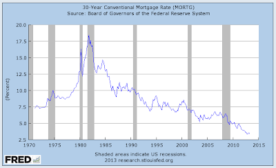
A recent interview of Robert Shiller on Yahoo Finance gives us a bit of insight on the main reason that the housing market in the United States appears to be on the rise again. Dr. Shiller notes the impact of the Federal Reserve on what could be yet another market bubble. The fact that the Fed is buying $40 billion worth of mortgage securities each and every month has impacted the mortgage market like this:
According to Freddie Mac's weekly data release, 30 year fixed mortgage rates are very, very close to 40 year lows, hitting a low of 3.35 percent in October 2012. To put this into perspective, these rates were between 6.5 and 6.75 percent just prior to the housing market implosion in 2006 and hit a peak of 14.67 percent in mid-1984. Over the period between 2000 and 2012, the average fixed 30 year rate was 5.82 percent, nearly 2.5 percentage points above today's rates. Obviously, once the Fed removes itself from the market and puts an end to QE3, all bets are off. Mortgage rates are likely to rise and homebuyers and owners will find themselves once again living in the real world.
What is particularly scary is Dr. Shiller's prediction that housing prices could well be the same in ten years as they are today. Today's housing price boom which has been driven largely by purchasers buying properties to rent, could well be the shortest on record, particularly as more households are forming in rental homes rather than in purchased properties.
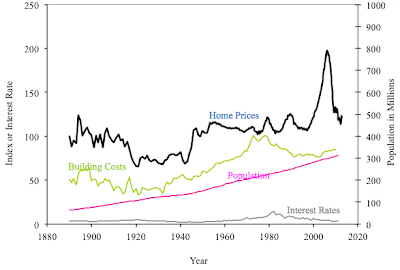
Looking at historical house price data collected by Dr. Shiller back to 1890 and corrected for inflation, it looks like we are just returning to the mean housing price after the deflation of a massive bubble:
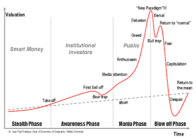
In closing, a fascinating schematic showing the buildup of an asset bubble by Dr. Jean-Paul Rodrigue at Hofstra University gives us a really good look at the mindset of the house-buying public during the development of the housing market bubble and shows us that, as I noted above, we are likely just returning to the mean:
Doesn't that one graphic say it all? Unfortunately, lessons from the past are sometimes very slow to be learned.
Click HERE to read more of Glen Asher's columns
You can publish this article on your website as long as you provide a link back to this page.


Be the first to comment