When the mainstream media feeds us economic statistics, they generally reference year-over-year or month-over-month changes, totally ignoring how current levels compare to historical levels.
One key measure of economic health is industrial capacity utilization. While manufacturing is less important to the U.S. economy than it was two or more decades ago, it sill provides us with a bellwether for the overall health of the economy.
Let's open with a brief definition. Capacity utilization is defined as the rate at which the United States economy is using the productive capacity that it has. It basically describes the amount of slack in the economy at a given point in time as a percentage of total potential output.
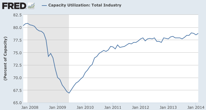
Here is a graph from FRED showing what happened to industrial capacity utilization as the economy crashed during the Great Recession:
Capacity utilization hit a low of 66.9 percent in June 2009 after falling from a pre-Great Recession peak of 80.8 percent in December 2007. Since June 2009, capacity utilization has risen steadily, first at a rather rapid rate until September 2010 when it hit 75.4 percent, an increase of 8.5 percentage points over a 16 month period and then more slowly, taking 40 months to rise by 3.4 percentage points to February 2014's level of 78.8 percent.
All of that sounds pretty good, doesn't it?
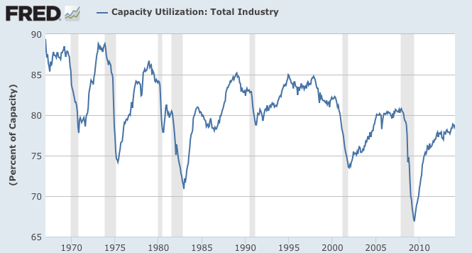
Now, let's look at the current level of capacity utilization in its historical context as shown on this graph going back to 1967:
At its peak in the 1960s, capacity utilization was just short of 90 percent. In fact, looking back at the period between 1994 and 1998, capacity utilization hovered between 83 and 85 percent, substantially better than the current level. When capacity utilization is at low levels, manufacturers have little incentive to expand their operations.
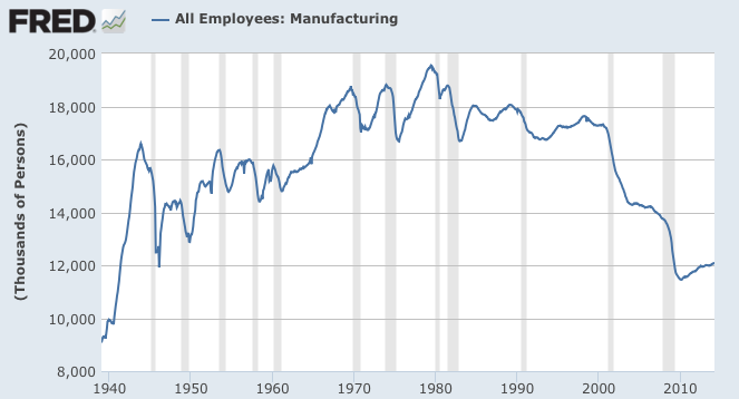
Here is a graph showing one of the results of the slack in America's manufacturing sector:
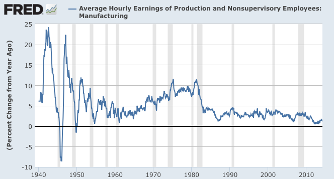
Here is graph showing what happened to the growth in compensation levels for those American workers who are still making things for a living:
The last graph shows the year-over-year percentage change in average hourly earnings for production workers in the manufacturing sector. Since the end of 2011, the hourly earnings of production workers have only increased by an average of 1.02 percent per year, about half of the 1.99 percent annual increase in hourly earnings for all workers. That tells us that the current relatively low level of capacity utilization in the manufacturing sector is having a negative impact on growth in wages for manufacturing workers.
Rather than focussing on the short-term changes to the multiple data releases that investors are subjected to on a monthly basis, I find that looking at the longer term, gives me a better sense of where the economy is heading, how the economy is changing and how well (or poorly) it has recovered since the so-called "end" of the Great Recession. By focussing on the month-to-month or year-to-year changes, we lose perspective on the long-term structural changes to the American economy
Click HERE to read more of Glen Asher's columns
You can publish this article on your website as long as you provide a link back to this page.


Be the first to comment