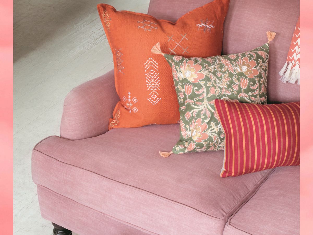
There's no such thing as going wrong with color because, ultimately, color is all about context — and, according to Rebecca Atwood, we all see and feel it differently — it's personal. The Brooklyn-based designer, artist, and now author of her second design guide, Living With Color, is on a mission to redefine how we consider tints, tones, and shades inside our homes. Atwood graciously answered our beginner Qs about her new book's subject matter — outlining everything from creating our own palettes to pairing and utilizing color IRL.
Atwood suggests looking to memories when starting a color journey; "Remember the places you have felt best and the colors that surrounded you. Understanding what you love is the most important thing." "Think about how each color makes you feel and then the purpose of the room you’re using it in," she shared. Whether you're starting small with pillowcases and coffee mugs or going big with armchairs and rugs, Atwood provides the meaningful framework for introducing color into your home — and we provide the shoppable suggestions for putting it into practice.
Scroll on to starting living with color and, as Atwood puts it, allowing yourself, "to appreciate the little moments of joy color can create."
[AdSense-C]
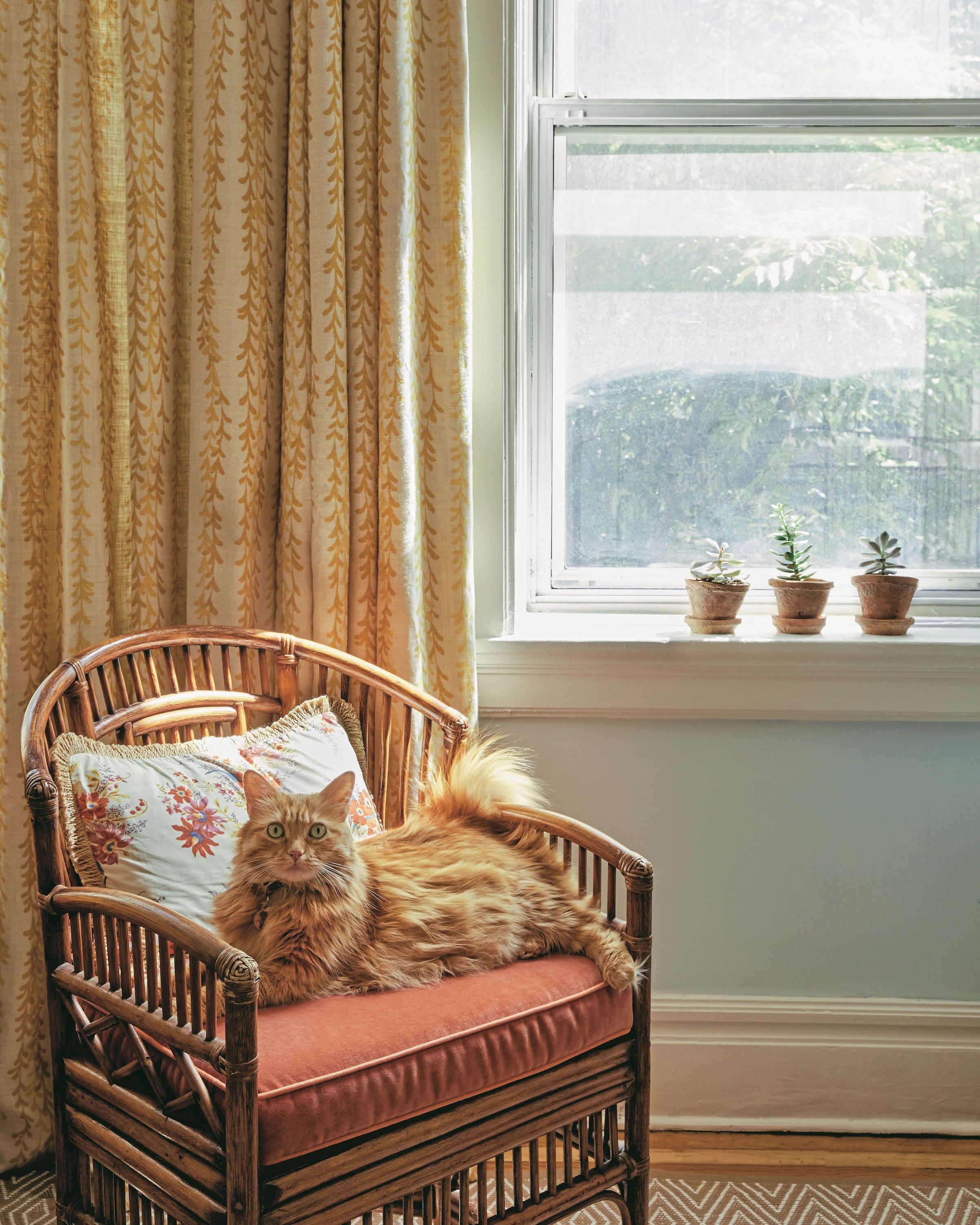
Color Isn't All About Brights Versus Neutrals
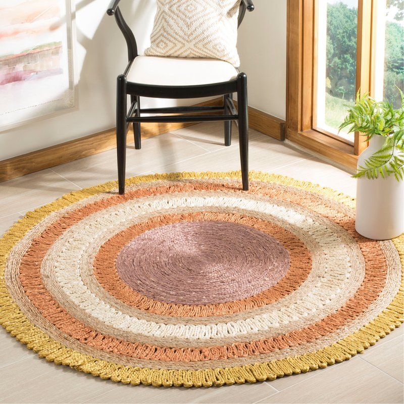
"Color can be quiet but rich, light and breezy, comforting and cozy, deep and moody. We often think first about bright, saturated color but then you’re missing out on all the tints, tones, and shades of a color. 'Neutrals' are just less saturated versions of a color."
Reprinted from Living With Color. Copyright © 2019 by Rebecca Atwood. Photographs copyright © 2019 by Sharon Radisch. Published by Clarkson Potter, an imprint of Penguin Random House, LLC.
Photographs copyright © 2019 by Sharon Radisch.
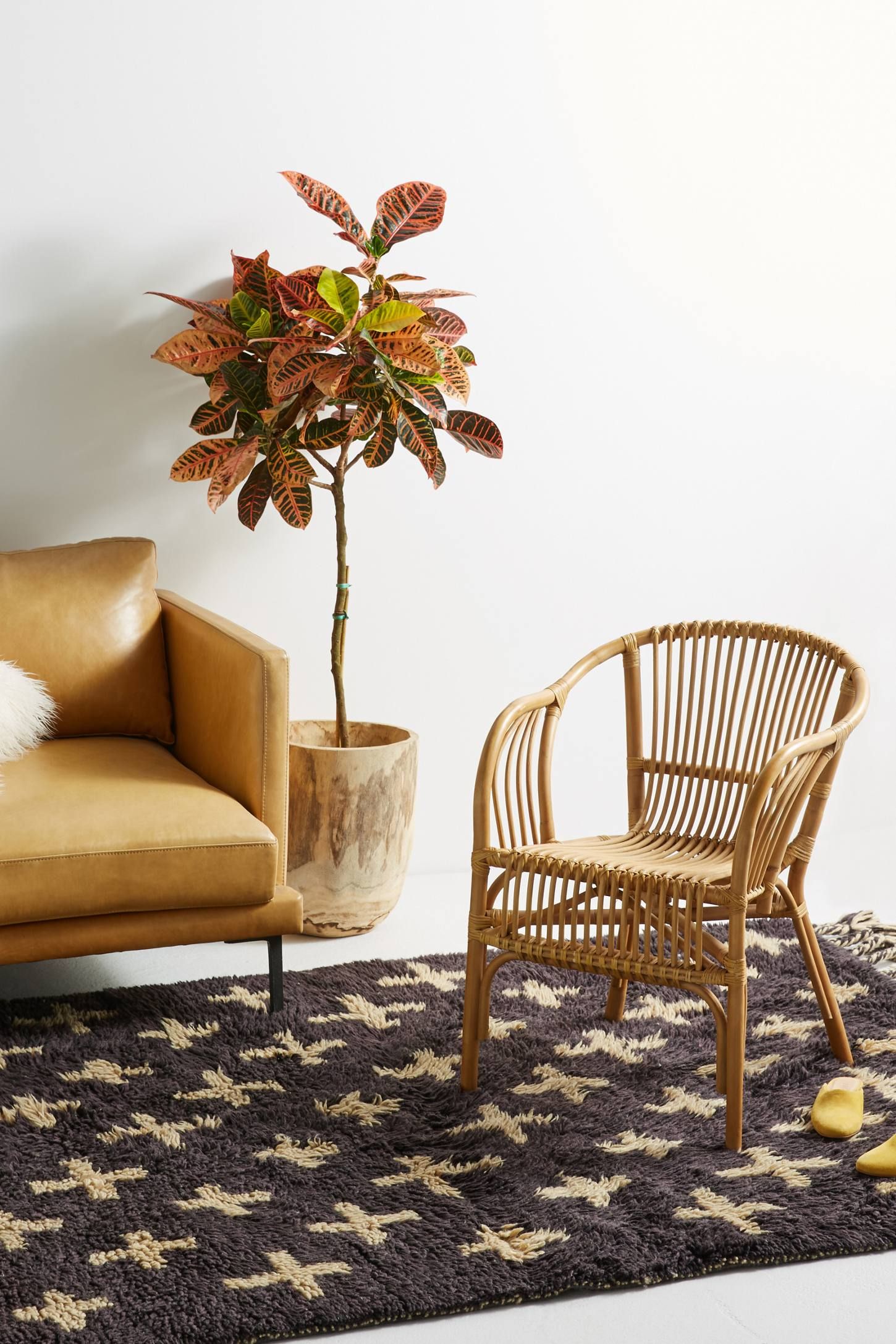
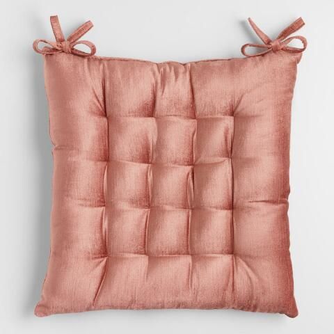
Choose Color Combinations That You Respond To
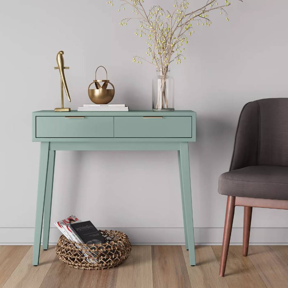
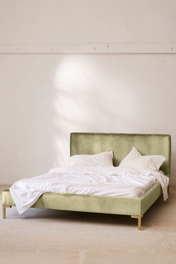
"Spend time really looking during your day-to-day and notice what you’re drawn to…Think about how each color makes you feel and then the purpose of the room you’re using it in. If green makes you feel calm (think about how you’d feel just walking through a path in the forest), it’s a great choice for the bedroom."
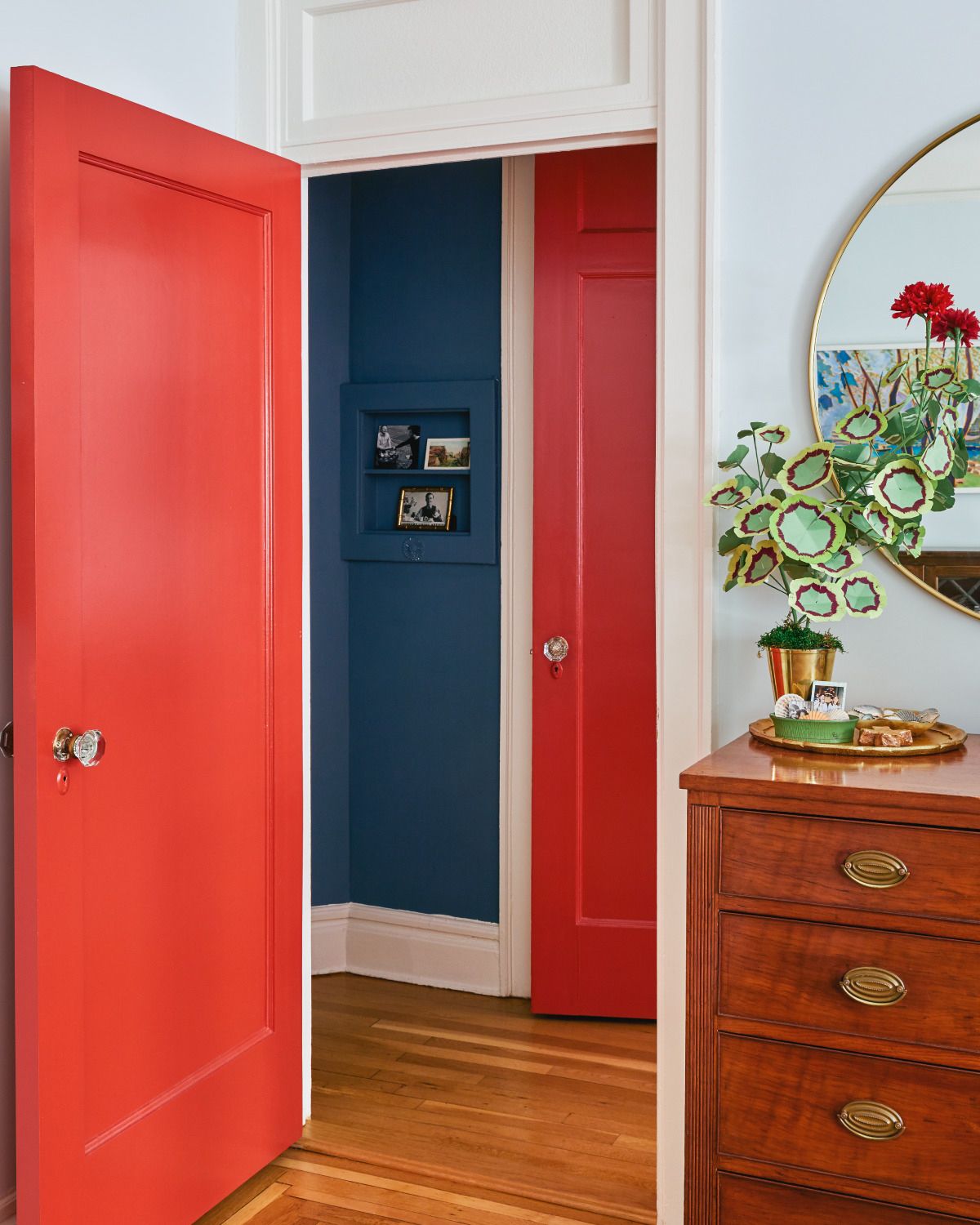
Project 62 Hafley Two Drawer Console Table, $116.99, available at Target
Use Popular Color Combinations As A Guide
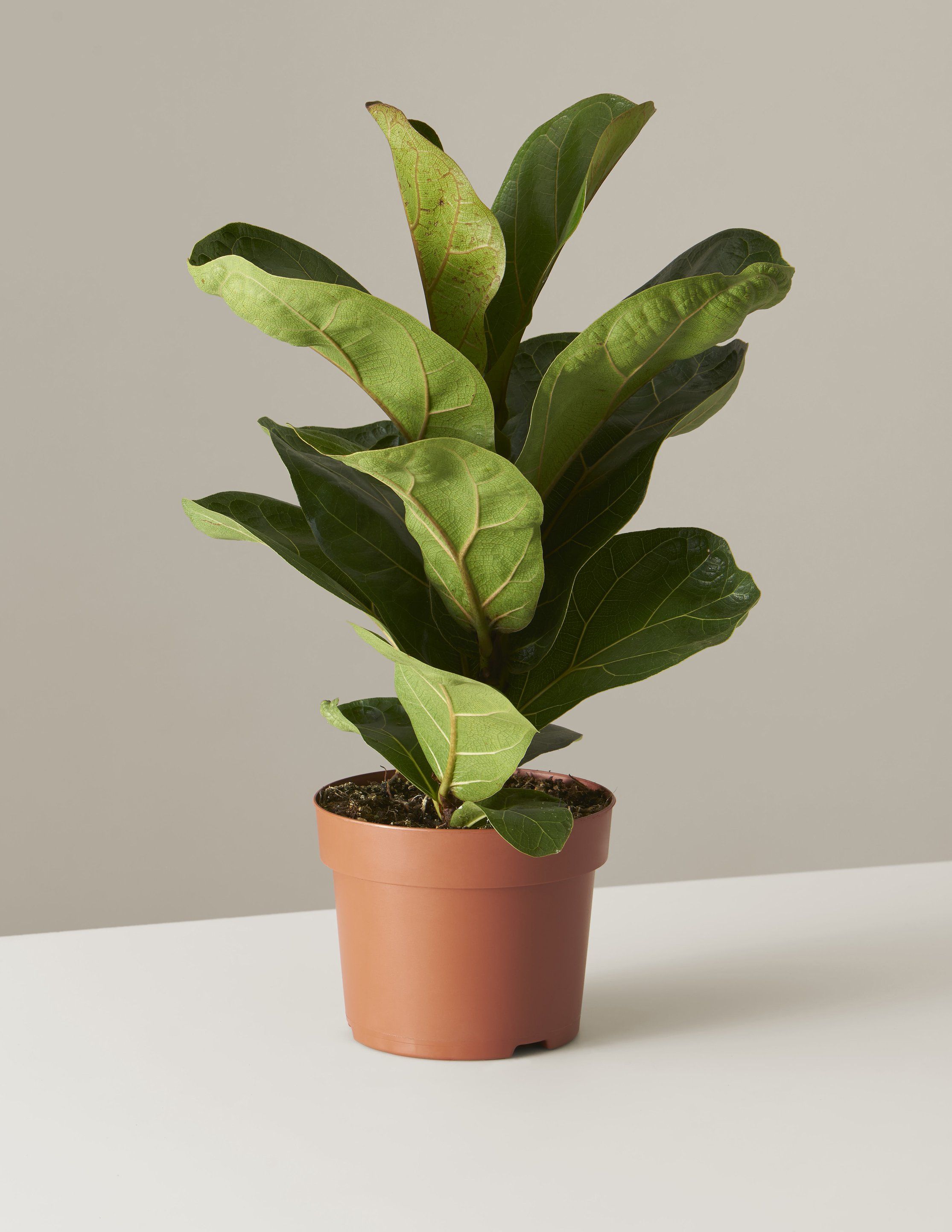
"– A classic palette for me: tomato red, peach, ocean blue, rose-taupe, gray-lilac, and navy
– Dune grass green, cloud blue, sand, taupe, a deeper green — I’m imagining the green of window shutters on a house on Cape Cod
– Buttery yellow with a hint of green in it (reminds me of spring!), soft tangerine, cloud blue, navy, taupe"
Reprinted from Living With Color. Copyright © 2019 by Rebecca Atwood. Photographs copyright © 2019 by Sharon Radisch. Published by Clarkson Potter, an imprint of Penguin Random House, LLC.
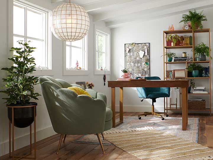
Work nook, available at World Market.
Photo: Courtesy of World Market.

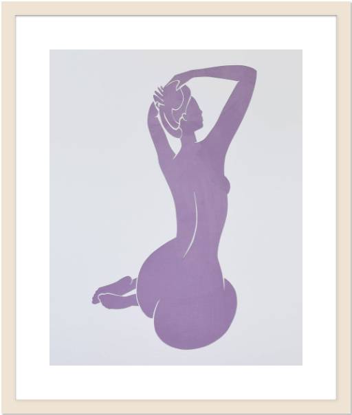
Find Your Artistic Muse
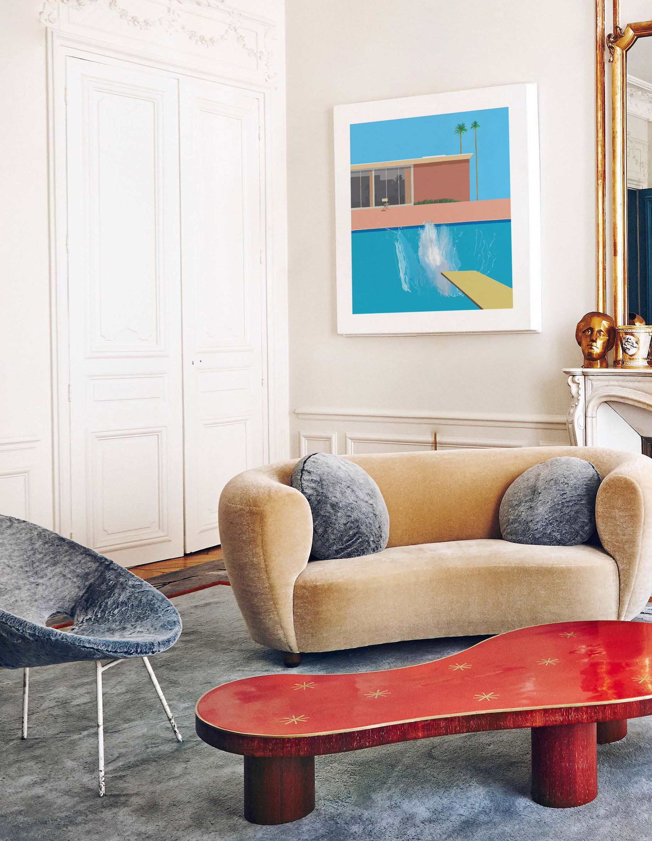
"Look to nature and artists for how they use color. I’m always inspired by David Hockney and Matisse for their color choices."
VillaCapriArtworks A Bigger Splash by David Hockney Modern Art Print, $33.32, available at Etsy
Click HERE to read more.
You can publish this article on your website as long as you provide a link back to this page.

Be the first to comment