As they do every year, Demographia has released its 2014 version of its International Housing Affordability Survey. As my long-time readers know, I am particularly interested in this analysis of the housing markets of several of the world's developed economies, largely because it measures affordability in terms that we can understand.
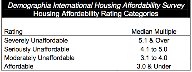
Demographia rates housing affordability using a concept that they call the "median multiple". The median multiple is defined as the median house price in a given market divided by the median household income in that market. Demographia goes on to assess housing affordability based on a range of median multiples as shown on this chart:
Historically, housing has been considered to be affordable when the median multiple is 3.0 or less, that is, the cost of a median house is three times the median household income in that market or less. The most severely unaffordable markets have median multiples in excess of 5.1 with gradations in between. Demographia assesses the real estate markets in 360 metropolitan markets across Australia, Canada, Hong Kong, Ireland, Japan, New Zealand, Singapore, the United Kingdom and the United States and assesses a median multiple for each except in the case of Japan where average multiple data is used (i.e. average price divided by average household income).
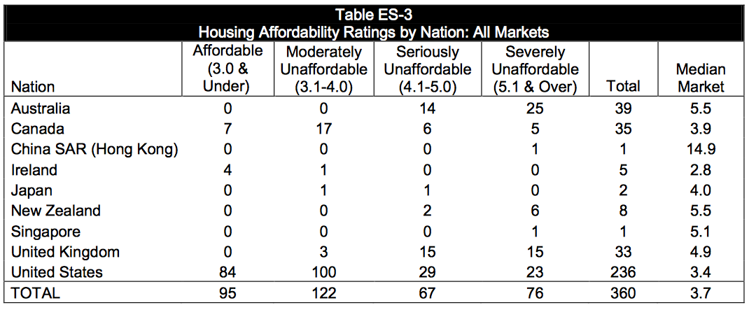
As background, here is a chart showing the housing affordability ratings for all markets in all nine nations:
You can see that the United States has the lion's share of affordable housing markets with 84 out of 236 markets or 35.6 percent of the total being affordable and 23 or 9.7 percent of the total being severely unaffordable. In contrast, Australia, Japan, New Zealand and the United Kingdom have no affordable housing markets and, in the case of Australia, 25 out of 39 of its markets or 64.1 percent of the total are considered severely unaffordable.
Now, let's get to the subject of this posting, housing affordability in the United States. In this posting, I will focus on how the U.S. housing market is divided; the 15 markets that are the most affordable and the 15 markets that are the least affordable when measured using the median multiple.
Let's start with a chart showing the 15 most affordable markets in the United States:
The majority of America's most affordable real estate markets are found in the former industrial heartland, many of them in Illinois, Michigan and Ohio. I've also included a column showing the median multiple from the previous Demographia study with data from 2012. You will notice that in 7 out of the 12 markets where Demographia had median multiple data in 2013, the affordability has actually improved on a year-over-year basis. When you look at the column showing the year-over-year change in the median prices for the 12 markets with data for both years, you'll notice that 7 of the most affordable markets saw median price declines of between 2.3 percent and 20 percent on a year-over-year basis. That is a rather significant drop in price given that the average value of homes on a nationwide basis has shown substantial improvement.
Now, let's look at the chart showing the 15 least affordable markets in the United States. In this case, you'll notice that all of them fall well above the 5.1 multiple that defines markets that are severe unaffordable:
Notice anything odd here? Of the 15 least affordable markets in the United States, only 2 are not in California! Last year, only 8 of the nation's 15 least affordable markets were in California. If you look at the column showing the year-over-year change in the median multiple, you'll notice that in every case where there is data for both 2012 and 2013, there has been a substantial decrease in affordability. As well, in all cases where there is data for both years, the median price of a home has risen. If we look at just the price data for the markets in California, year-over-year price increases range from 18.7 percent to a whopping 60.6 percent!
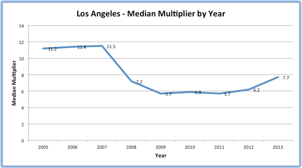
Let's take a quick look at what has happened to the median multiplier in Los Angeles since 2005:
Notice the rapid drop from 11.5 in 2007 to 5.7 in 2009. While Demographia would classify Los Angeles' real estate as severely unaffordable at a multiple of 5.7, it was a great deal more affordable than it was two years earlier. You'll also notice that the median multiple is starting to rise again, hitting 7.7 in 2013, its highest level since 2007. Real estate in Los Angeles is becoming increasingly unaffordable for a median family yet again. The same can be said for Santa Barbara, San Francisco – Oakland, Santa Cruz, San Jose, San Luis Obispo and San Diego, all of which have seen substantial year-over-year decreases in affordability in 2013 from levels that were already severely unaffordable in 2012.
It's quite interesting to look beyond the national real estate data and see that, once again, it appears that bubbles could be reforming in some markets, particularly in California whose market is behaving far differently than the markets in the old industrial belt. Perhaps some of the blame for reinflating the bubble can be laid at the clay feet of the Federal Reserve and its zero interest rate policy, a policy that is once again allowing home purchasers to buy way more home than they can afford.
Click HERE to read more of Glen Asher's columns
You can publish this article on your website as long as you provide a link back to this page.


Be the first to comment