This article was last updated on April 16, 2022
Canada: ![]() Oye! Times readers Get FREE $30 to spend on Amazon, Walmart…
Oye! Times readers Get FREE $30 to spend on Amazon, Walmart…
USA: ![]() Oye! Times readers Get FREE $30 to spend on Amazon, Walmart…
Oye! Times readers Get FREE $30 to spend on Amazon, Walmart…
When the Bureau of Labor Statistics releases its monthly Consumer Price Index, it generally seems that the headline inflation rate really doesn't reflect our own personal inflation reality. In many cases, consumers experience far higher price increases than the modest 2 or 3 percent that are reflected in the CPI. A brief article by Scott Wolla at the Federal Reserve Bank of St. Louis explains why there is a disconnect between what the BLS tells us about inflation and what we experience as consumers.
Let's start by looking at how inflation is measured. The CPI measures the average change over time in the prices paid by urban consumers (who represent 87 percent of Americans) for a market basket of consumer goods and services. The CPI market basket is constructed using input from consumers; for the latest iteration of the market basket, the data on what consumers spent was gleaned from spending diaries kept by 28,000 consumers and from 60,000 interviews conducted with consumers in 2011 and 2012. Price information is collected on a monthly basis for the 80,000 items in the market basket. The prices of goods and services in the market basket are indexed to a value of 100 so that the changes in the index value over time can be used to calculate the inflation rate.
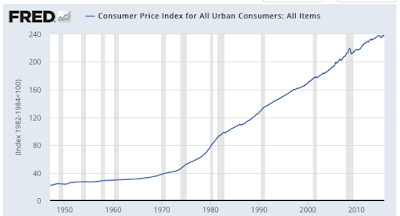
Here is a graph showing the indexed CPI since 1947:
The data is indexed to a value of 100 in 1982 – 1984. The same basket of goods and services that had an index value of 100 in 1982 – 1984 now has a value of 238.042 meaning that it has risen by 138.042 percent over the thirty year plus period.
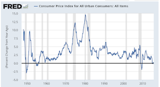
Here is a graph showing the percentage change in the cost of the market basket of goods on a year-over-year basis:
The year-over-year increase in the cost of a basket of goods and services has varied widely over the decades from a high of 14.6 percent in March 1980 to its current level of 0.12 percent.
Like many statistics, price statistics are reported as an average; an average American consumer is 37.6 years old and their average per capita income is $46,163. Obviously, both age and income will have a substantial impact on the consumption of certain goods and services which will have an impact on a household's inflation rate. Let's say that you drive very long distances to work; as gasoline prices rise and fall, the impact of changes in the price of gasoline will impact your household far more than a household that consists of retired people who do not have to commute to work or a household that relies on public transit for commuting. The same can be said for any good and service that your household utilizes. Basically, every household has its own inflation rate, in other words, individual experiences with inflation may vary.
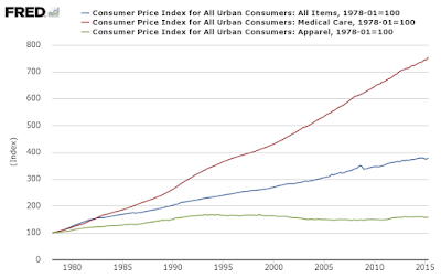
Now, let's look at a graphic showing how much the consumer price index varies depending on the good or service:
With 1978 set at 100, we can see that medical care has risen far more than either apparel or the "all items" inflation rate. In fact, over the 37 years, the price of all items in the market basket have risen by 278 percent or 3.7 percent annually compared to a whopping 653 percent for medical care which results in a 5.6 percent annual price increase and 57 percent for apparel which results in a 1.3 percent annual price increase. Obviously, since an average senior American consumes more medical care than a younger American, they have felt a far greater impact of rising prices for this item than their younger counterparts.
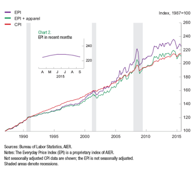
Another measure of inflation has been developed by the American Institute for Economic Research. The Everyday Price Index or EPI has been designed to reflect price changes for goods and services that consumers purchase at least once per month thereby reflecting the price changes that are felt by most Americans on a day-to-day basis. Unlike many of the items in the CPI market basket, purchasing the items in the EPI cannot easily be postponed by consumers . This means that consumers must absorb the fluctuations in prices of these items. Nearly half of the EPI basket consist of food consumed at home (21.5 percent), food consumed outside the home (15.1 percent) and household fuels and utilities (13.4 percent). By comparison, these items only "weigh" 19.4 percent in the BLS market basket. This makes the EPI basket much more volatile than the BLS headline inflation rate, however, it appears to better reflect our own experiences with inflation.
Here is a graph showing a comparison between the CPI (in red) and the EPI (in purple):
While the difference may not seem significant, in fact, over the past 20 years the EPI shows that everyday prices have risen by 76 percent (average rate of 3.2 percent annually) compared to 56 percent for the CPI (average rate of 2.3 percent annually). Apparently, when the BLS includes such items as cars, appliances and furniture in their inflation equation, these rarely purchased items have a significant downward pressure on inflation.
When you read items like this which suggest that the Federal Reserve has not met its 2 percent inflation target for more than 3 years, you'll now have a better understanding of why your personal inflation rate experience varies greatly from what the headline inflation numbers would suggest and why many of us have a hard time believing that inflation is almost non-existent.
Click HERE to read more of Glen Asher's columns
You can publish this article on your website as long as you provide a link back to this page.


Be the first to comment