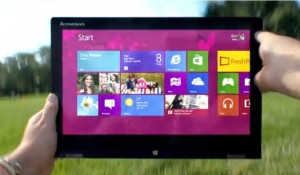
A new ad promotes Windows 8 doing fun things – in reality it feels like a first release with too many rough edges

Windows 8 has a fun interface that works on tablets and desktops but is not ready for prime time
Microsoft has crossed an enormous chasm with Windows 8. We now have a single computing platform for phones, tablets, laptops and desktops. That’s amazing but they need to finish the job.
Don’t get me wrong. I’m a big Windows 8 fan and have used it for a year and enjoying it. I am also frustrated by the First Release feel.
I delayed upgrading my third computer until the last-minute on January 31st to capture the expiring $40 upgrade. Do I need any more grief?
The negative sentiment about Windows 8 is widespread. For instance Microsoft experienced high return rates with the Windows 8 Surface RT. According to ComputerWorld ”It (high retail returns) seems to be linked in many cases to a steep learning curve of the [Windows 8] OS — which is not necessarily intuitive.”
Things go wrong in Window 8 and need computer skills to fix. The user interface is a beautiful design that ignores user factors and ergonomics.
Windows 8 feels like code that is almost finished. It needs user experience and feedback from tens of millions of people. I’m sure Microsoft is working on fixing the rough edges. Sometime in the future we will get Service Pack 1 or Windows 8.5. Then it will be ready for prime time.
No doubt Microsoft will fix the problems like they have in the past. 5 years ago they had to change the new Office 2007 ribbon bar since it confused people. Windows Vista got fixed by Windows 7.
Windows 8 is like a new house and we’re hoping the contractor comes back to finish up.
Yes the user interface is cool. Yes touch screens are cool. Yes having a phone that acts like the computer is cool. But those things are not enough.
Windows 8 Desktop Internet Explorer 10 crash
When the Internet Explorer browser stops working in the middle of a project, that’s frustrating and wastes time.
The Desktop version of Internet Explorer 10 crashes regularly. Some days it just goes blank when I move back and forth between tabs. The Microsoft Windows Forum suggests the usual suspects like add-ons, conflicts, run the Troubleshooter and Refresh IE 10.
Last night Microsoft suggested removing it, rebooting, adding IE 10 back and rebooting again. I should be testing that but I need to get my work done first.
In comparison, the Firefox browser is not locking up. Actually, I switched to Google Chrome for a browser – don’t tell Microsoft. It’s fast, the most HTML 5 compatible browser and gives me no problems.
Windows 8 feels unfinished
The “Troubleshoot History” report, which I needed to fix the IE 10 problem, is unfinished. It has a bug that sorts dates as numbers not dates. That’s not a major issue, but it is confusing when you are trying to read it in date sequence, just another little thing they didn’t get right.
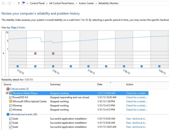
In the process of trying to fix the cause of the browser crashes I did discover a new report that logs problems over time – the Windows Reliability Report.
It looks impressive until I realized it only logged 5 instances of IE 10 crashing in January. Another error log deeper in the system revealed it was crashing more than once a day. It’s a nice report but not reliable.
Windows 8 touch screen ergonomics
Touch screen is fun but it seems Microsoft wants us to exercise our arms to carry out simple tasks. Instead of touch points being clustered by logical function, none of the screen controls are near each other so your hand is moving top to bottom, left to right and back again. It’s not efficient and quickly tiring. What looks fun on a tablet gets tedious on a 23&Prime screen.
Windows 8 Charms Bar is not charming
Standard functions are on the Charms bar on the right edge of the screen.
It creates a single point from which to Search for documents or programs.
Within apps, you can Share things on social media.
Start takes you back to the Start menu.
All programs that need Search use the same Charm function.
That sounds logical except the feature is external to the app. The search is by name and file type. Touch the screen and the Charms bar disappears the moment you select an item.
Search does not allow you to sort except by file type which is useless when you have thousands of files on your computer.
Think of all the songs, videos and documents that might be on a computer.
While fast, the results are information overload.
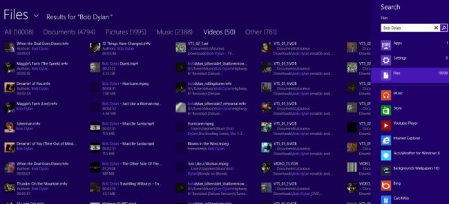
For example, a Charms Bar Search for Bob Dylan quickly gave me 10,000 items by documents, pictures, music, videos and other.
Actually finding what I wanted takes swiping right to left through page after page.
Touching a file brings up the default app or program for the file type and the search screen is lost.
That’s cute but not productive. Most of the time I use the standard Desktop Explorer to search. There are more options to search on. I can actually move files around along with launching a program or app. And Desktop Explorer is persistent and does not disappear off the screen the moment I touch anything.
Why didn’t Microsoft build more functionality in Charms Search? Why are most of the Windows 8 Apps limited in functionality?
The answer is probably that we need Windows 8.5 or at least a comprehensive Service Pack 1.
I’m confident Microsoft will fix Windows 8 but it’s not ready for prime time.


“The user interface is a beautiful design that ignores user factors and ergonomics.”
Really? That’s the WEIRDEST description of a “beautifully designed” interface I’ve ever seen. It would seem to me that any interface that ignored user factors and ergonomics would be described as a “terrible interface”. Perhaps you meant that the user interface used beautiful colors, though I think in the case of Metro UI, even that would be debatable.
“Beauty is skin deep” is the saying. The prettiest girl or most handsome boy may not make the best marriage mate. Life and software are complex.