As my regular readers know, I like graphs. I guess it’s the scientist in me. To me, graphs are a very simple way of explaining things, particularly things that are transpiring in the economy, particularly when comparing the present to the past. I source quite a number of my graphs from FRED, the Federal Reserve Economic Data, a database which is maintained by the Federal Reserve Bank of St. Louis. This database contains data on more than 41,000 time series on many aspects of the economy, some mainstream and some very rarely used. FRED’s data is gleaned from the Federal Reserve, the United States Census Bureau and the Bureau of Labor Statistics among other sources.
I was researching information from FRED for a future posting and stumbled on two graphs that I found, one of which is the one of the most shocking graphs that I have seen. Before I show you the graph, let’s me supply you with a bit of background information so that you can put what you are seeing into context.
Central bankers often use the term Adjusted Monetary Base (AMB). The Adjusted Monetary Base is defined by the Federal Reserve as "…the sum of currency (including coin) in circulation outside Federal Reserve Banks and the U.S. Treasury, plus deposits held by depository institutions at Federal Reserve Banks.". It is basically M0 which is the narrowest definition of money and is the ultimate source of the nation’s money supply.
Now, here’s the first of the promised graphs from FRED showing the growth in the Adjusted Monetary Base since the beginning of 2009:
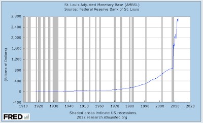
Certainly, it looks like the AMB has grown; it started at $1.59 trillion in early 2009 and grew by $1.14 trillion or 71.7 percent to $2.73 trillion at the beginning of 2012. That’s a very steep growth curve but things get worse when we look at the next graph which shows the growth in the Adjusted Monetary Base back to 1920:
Over the past century and certainly since prior to the Great Depression, the Fed’s Adjusted Monetary Base grew at a slow, steady rate with a slight increase in the growth rate during the period from 1990 to the beginning of the Great Recession. In the 1960s, the AMB grew by 1 to 2 percent per year, in the 1970s by 6 to 8 percent per year, in the 1980s by 6 to 10 percent per year and in the 1990s by 5 to 10 percent per year.
Here’s a graph showing the annual percentage growth in the Adjusted Monetary Base since 2000 noting that the data shows growth from January 1 of a given year to January 1 of the following year:
Notice the massive growth in the AMB in 2008; the Adjusted Monetary Base grew from $851 billion to $1730 billion in just 12 months, a 103.2 percent increase. In 2009, the AMB grew by 16.2 percent, nearly triple the average annual growth rate of the previous decade, in 2010 it grew by a very modest 2.3 percent but that changed in 2011 when the AMB grew by 28.7 percent or $591 billion from $2.057 trillion to $2.648 trillion, a growth rate that is roughly four times the average annual growth rate of the previous decade and the second highest annual growth rated since 1920 by a wide margin.
The expansion in the Adjusted Monetary Base since 2008 is unprecedented. If we look at another crisis of confidence in the American economy, after the attacks of September 11th, 2001, the AMB grew by only 9.2 percent in 2001 (for the entire year) and 6.8 percent in 2002, growth rates that were on par with the previous two decades despite the severity of the crises.
It is generally believed that rapid growth in the monetary base has preceded accelerated inflation in the United States and other countries. The massive growth is related to the "printing" operations carried out by the Fed during the bailout/rescue operations of 2008 – 2009. The increased "printing" operations in 2011 were most likely related to the Fed’s quantitative easing and "Twist" programs, both of which have been only marginally successful considering the risk to the economy over the long-term.
I have a couple of questions. Is the current level of the Adjusted Monetary Base the new baseline for the economy? If it is, what will happen if all of those electronic digits sloshing around in the system create inflationary pressures, asset bubbles or other unforeseen issues? If this is not the "new norm", what effect will contracting this vast amount of money lurking within the system have on the economy?
As I’ve said before, economics is the furthest thing from a science. The impact of monetary policy have far-reaching impacts that are totally unpredictable and which cannot be foreseen by those that we are "trusting" with our future. For one, I find the massive and rapid expansion of the adjusted monetary base a very frightening issue. Only time will tell if my feelings are justified.
Click HERE to read more of Glen Asher’s columns.
Article viewed on Oye! Times at www.oyetimes.com
You can publish this article on your website as long as you provide a link back to this page.


Be the first to comment